How do you communicate 140 pieces of information in something that’s nice to look at?
With an infographic, obviously.
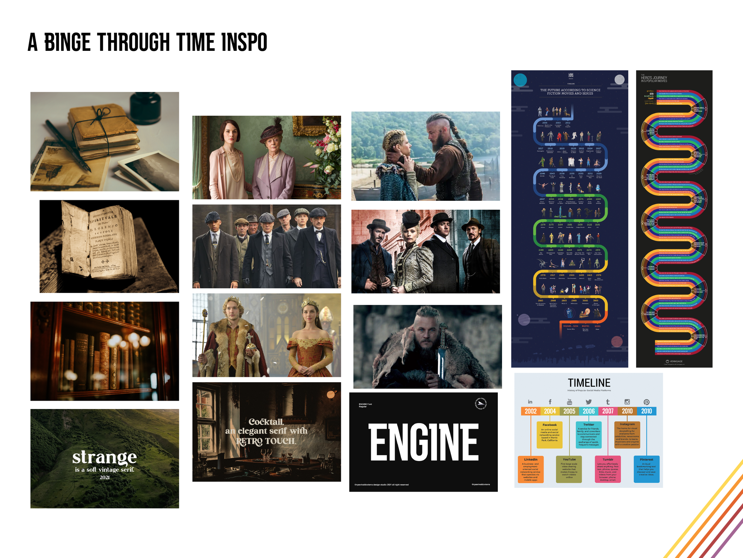
A Binge Through Time is here to answer your burning questions: what show should I watch next? When do I want to explore?
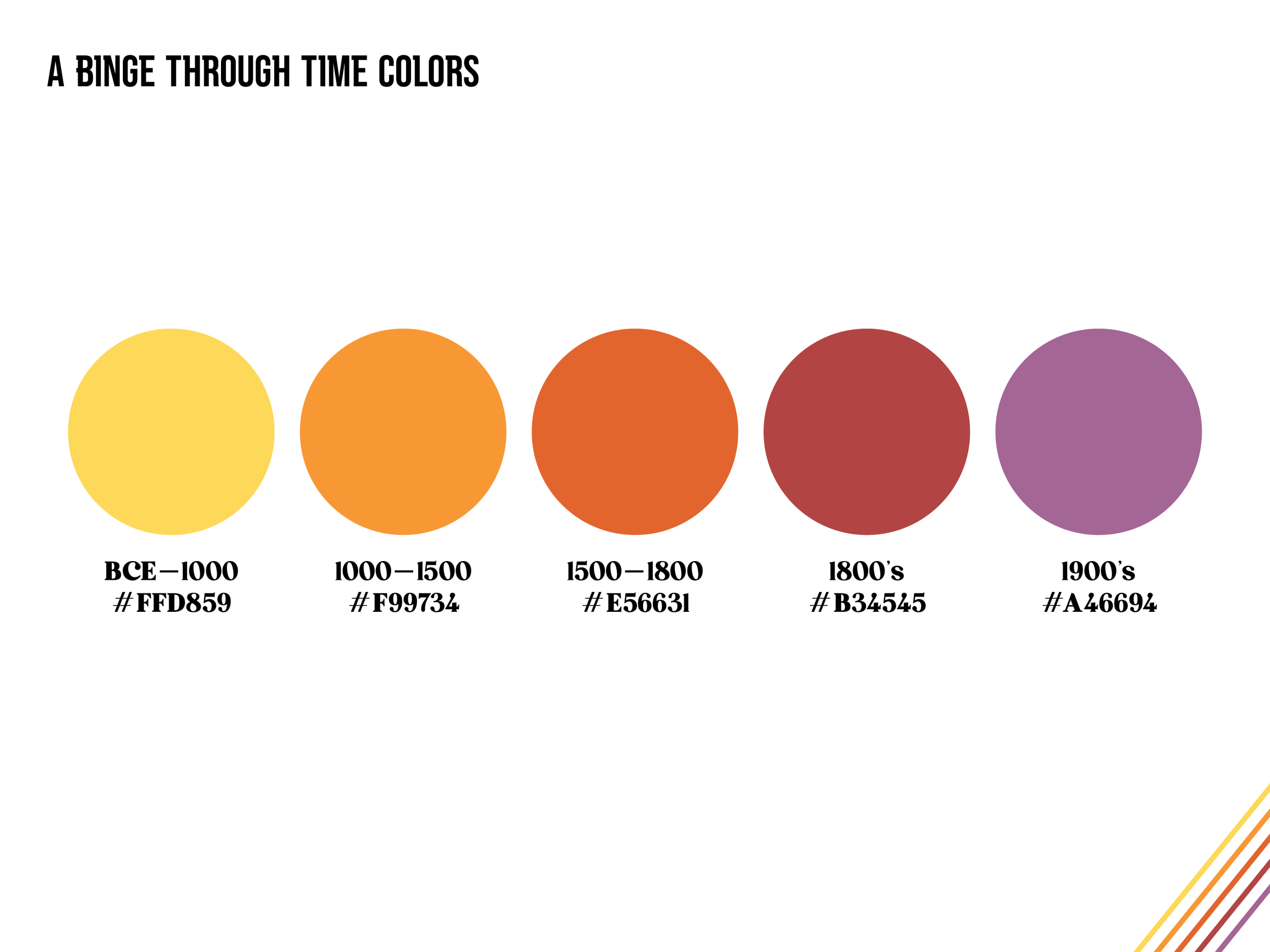
Split across five time periods, this categorized and color-coded infographic provides information on 35 different TV shows spanning millennia from the Roman Republic to the Pacific Theater of WWII.
Project Scope: Concept, Research, Data Visualization, Design
How It’s Made: Illustrator, InDesign, Photoshop, Excel


While the concept of the infographic itself may have begun as an assignment, the subject matter here is definitely a passion project. I’ve always loved historical fiction - whether books, movies, or TV shows, and a great many of those TV shows have been watched with my dad.
This class project very quickly evolved into a 60th birthday present for dad and is now an expanding series in the works that you can follow on Instagram @abingethroughtime. Before it got this far though, it started with just an idea and a spreadsheet.
Knowing the purpose and who it’s for, this really only started with a list of the historical shows my dad and I have both enjoyed (some together, some because one of us repeatedly pestered the other to watch it). Then, all the shows that one of us has repeatedly pestered the other to watch, but we haven’t gotten to yet. That was... not enough.
One of the challenges for creating this infographic was editing: deciding which information was worth including and making sure that the design was legible. It couldn’t be too busy, but it couldn’t be scarce either – we’re trying to share the history of the world here!
At this point, I thought if I focused on how to organize the data, I could figure out how many points were needed and then backtrack to fill in the gaps. There had to be some kind of system for grouping these shows that made sense to anyone, even if they weren’t a huge nerd about the subject already (if only I’d known about card sorts a few months earlier).
It’s a timeline, we already know it’s a timeline, so sorting by when the show is set was an obvious choice. That in itself didn’t really provide the end-user with much information though. They know when it’s set, and? What else do you care about when you’re looking for something to watch? If you’re my dad, you definitely want to know the vibe of the show. Anything where somebody doesn’t die in the first three minutes is relegated to “romantic comedy” or “soap opera” in his book. These data points were pulled from descriptions of each show, with tweaks and adjustments made based on my personal experience (or what I knew dad was going to say).
Great. Concept, done. Organization, sorted. Data... getting there.
Now that I had a system for categorizing the shows, I could go back and decide how to balance out when in time they happened. Some categories had ten shows, some had four, looks like there’s more research to do. Oh no, I have to find more historical TV shows I haven’t watched yet. I am clearly devastated.
All that research and here we are. Five time periods, 35 shows, now what? How much of this actually needs to be in the infographic? Do I include where each show is streaming and risk rendering the entire design obsolete in just a few months as shows come and go on various platforms? Let’s not.

So, priorities are: well, the name of the show is probably important, the time period it’s set in of course, and some way to tell the user what kind of show they’re getting into. Now how do you present four data points x 35 shows in a legible poster? How do you communicate 140 pieces of information in something that’s nice to look at? Therein lies the problem for me to solve.